Chart of the Month: July 2005
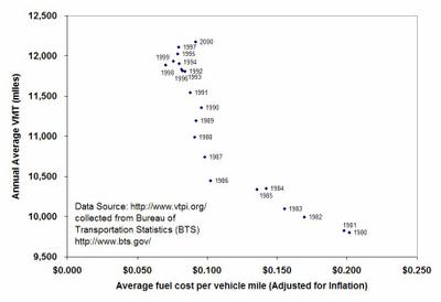
In this months chart, I was going to post about the driving costs, and how gasoline and oil costs constitute only a small fraction of overall driving expenses. I realized that the Chart of the Week guys have already addressed that earlier this year. So, I have decided to take it a step further. In the previous charts, we have seen that the fuel economy of vehicles has either increased significantly as compared to late 70's. This has made driving cheaper than it already was. economists call this the rebound effect. The following chart shows that the cost of driving per mile for passenger cars has steadily decreased from 1980 to 2000, and as a result average vehicle miles traveled have increased from about 9,700 miles per year in 1980 to about 12,200 miles per year in 2000. This has been one of the main reasons for increased overall driving as seen from April's chart of the month.
 (click on the chart for a larger image).
Economists argue that the rebound effect is of the order of 20%, that is a ten percent improvement in fuel economy increases vehicle travel by about 2%. So, next time when we argue that higher fuel economy standards are a good thing, we should keep in mind that some of the gains from higher fuel economy will be squandered away by increased driving. It may also indicate why CAFE standards should not be the only policy option on the table if we are serious about reducing our usage of petroleum.
P.S. The chart of the month archoive is available on your right.
P.P.S. It is so much easier to add pictures to blogger now. Bye bye Hello!
posted by APB at 3:20 PM
![]()


0 Comments:
Post a Comment
<< Home